

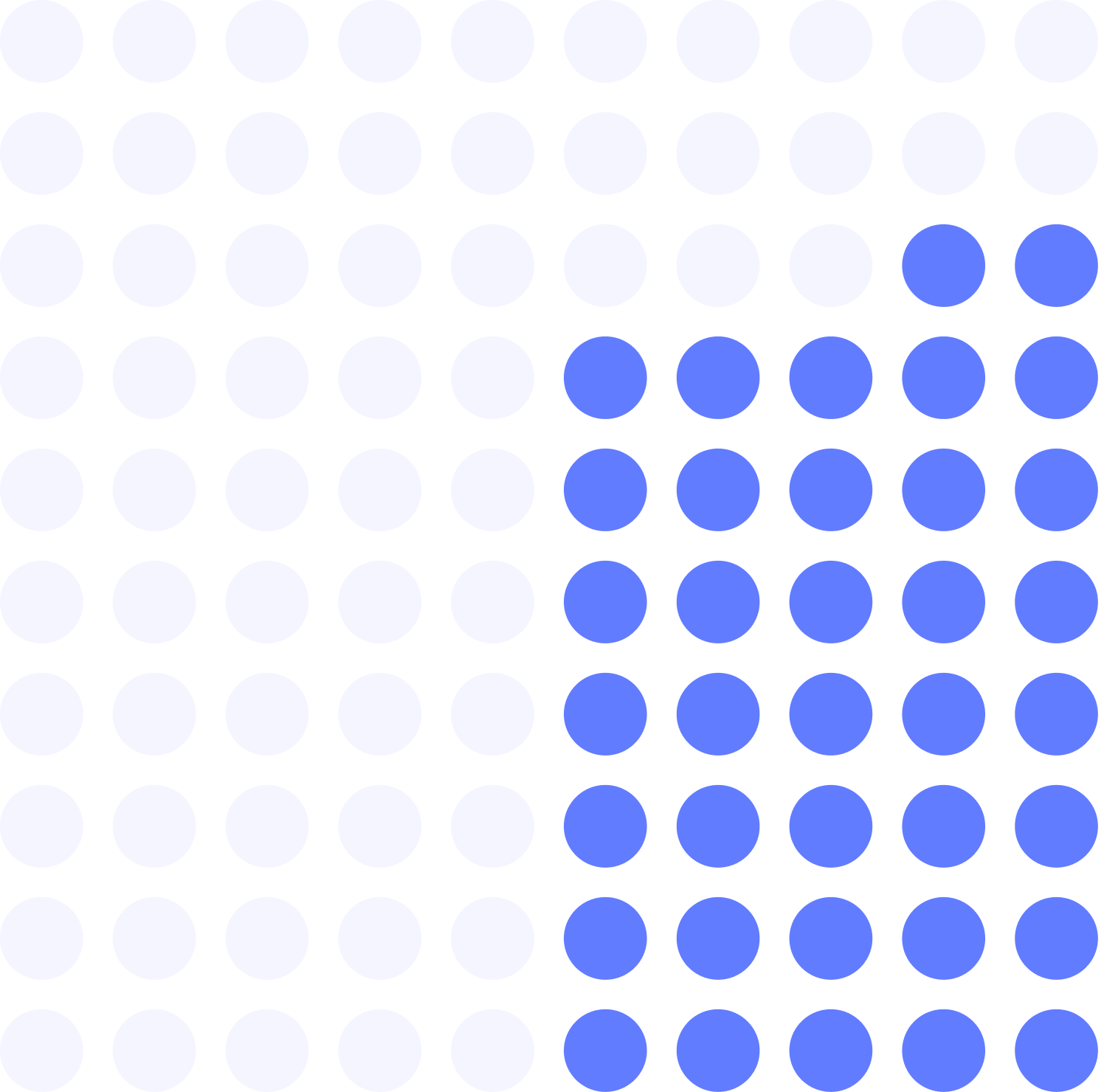
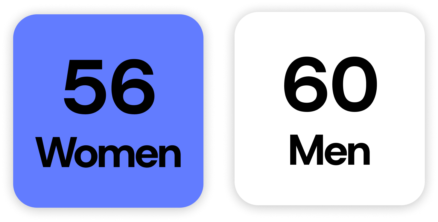
A problem that hit close to home
My aunt and my grandfather both had type 1 diabetes. My grandfather passed away when he was 75.
My aunt passed away January of 2026 at 65.
I spent the last six years of her life unable to visit her. She was too immunocompromised to risk it.
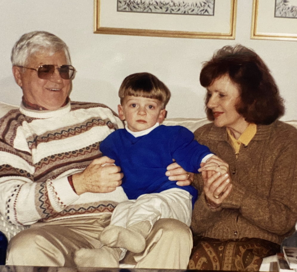
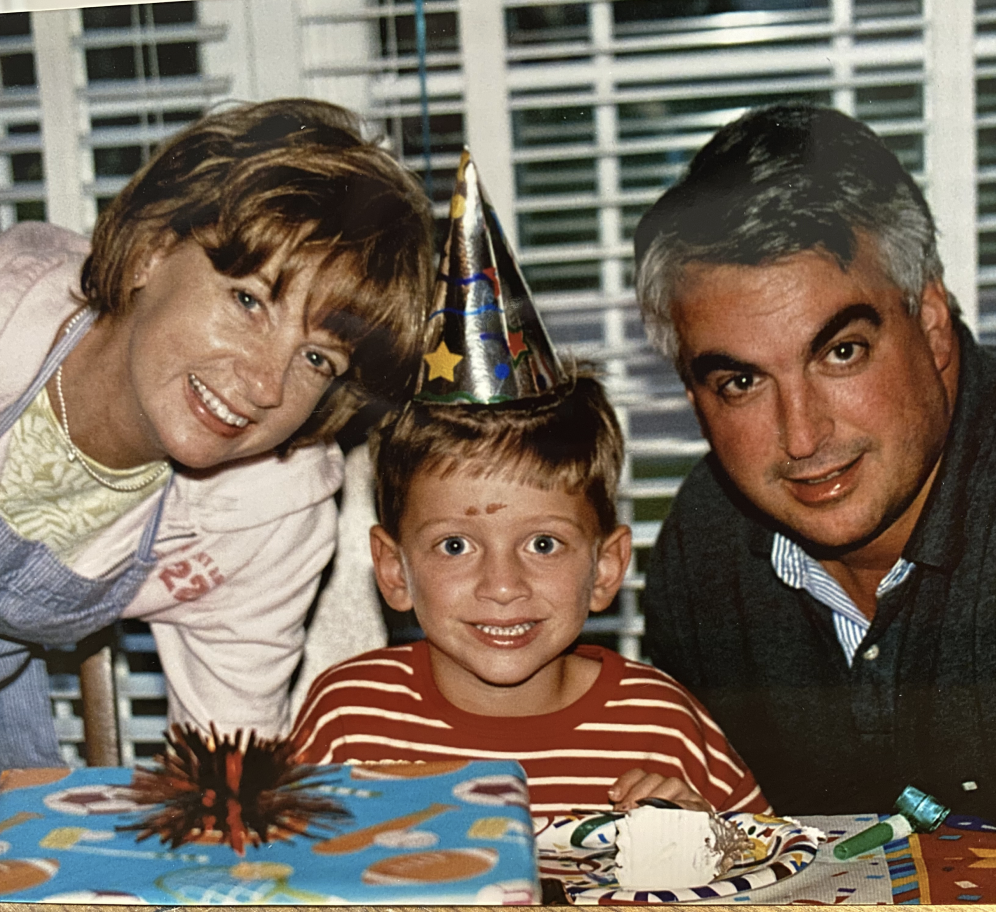
I knew that type 1 diabetes was serious, but I didn't know it was measurably more serious if you were a woman. I definitely didn't know why.
What I eventually learned was that the gap wasn't biological destiny. It was a research failure as a result of decades of studies that excluded women, or ignored the ways their bodies worked differently. A century of missing data that translated directly into worse outcomes.
That finding was what this project was about. Not just raising awareness of a partnership, but making the case that a gap this consequential deserved to be known.
Defining the problem I could solve
Tidepool and Oura had announced a partnership to collect open-source data on how menstrual cycles affect glucose management in women with type 1 diabetes. The initiative was significant, but public awareness of it wasn't.
The design problem wasn't simply "build a landing page." It was:
How could I make someone care about a health inequity they'd never heard of?
That question shaped every decision that followed, starting with the research.
Equipping myself with facts
What I found when I researched the issue of the type 1 diabetes gender outcome gap was more specific than I expected, and worse. This wasn't a vague disparity. It was documented and quantified across multiple independent studies, and could be summed up with one devastating statistic:
The reason was well-documented too, and it wasn't biological. It was a research discrepancy.
These findings reframed everything. This campaign wasn't about a partnership. It wasn't even about outcomes.
This campaign was about a century of missing evidence, and what it had cost.
Building a strategic foundation
Now that I was good and pissed off, I started to build out the campaign's strategy, beginning with defining its goals.
Goal 1
Convey to the audience why this mattered.
Goal 2
Communicate what Tidepool and Oura were doing to address it.
Goal 3
Inform the audience what they could do to help.
Two distinct groups emerged with different relationships to the problem:
Audience 1
Women living with type 1 diabetes
Audience 2
A general public that included press, donors, and health advocates
Each needed a different call to action, but both needed to leave the page understanding why this issue mattered, what Tidepool and Oura were doing to address it, and what they could do to help.
The tone should be warm but credible.
Human enough to move people, rigorous enough to earn trust. The copy shouldn't editorialize. It should let the data do the work.
The page's visual design shouldn't compete with the statistics that are illustrating the issue, it should highlight them.
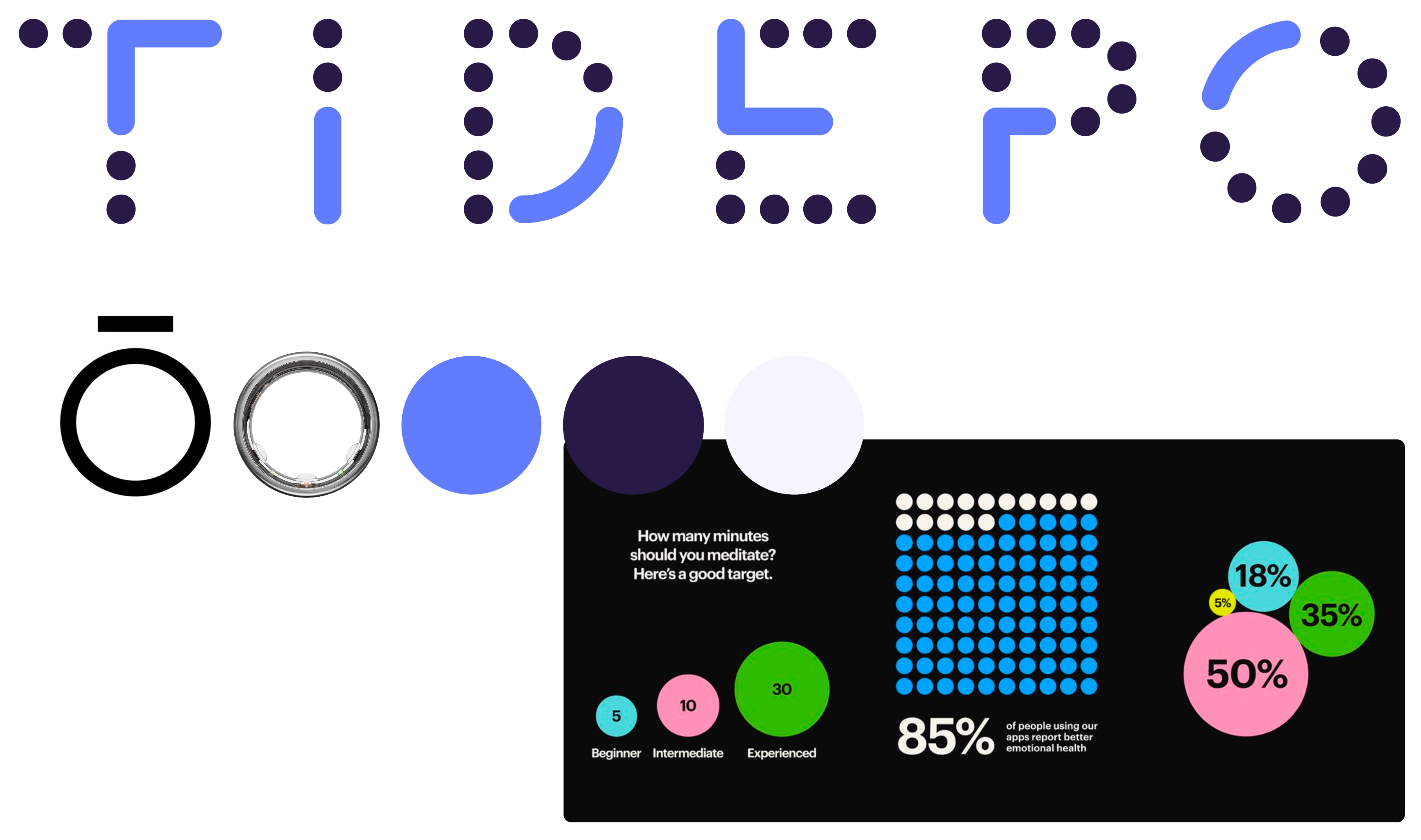
For the colors, I settled on using a nearly-black shade of Tidepool's blue for the page's background, which allowed the single accent color, Tidepool's indigo, to pop.
The circles and dots from Tidepool's branding system became useful building blocks for this landing page.
Bringing the solution to life
The page was structured in two moments: The Outcome Gap, and The Research Gap.
The first established what was happening to women with type 1 diabetes. The second explained why.
Each moment was illustrated by a series of simple statistics, driven home by looping, animated data visualizations.
The data visualizations were designed in Figma and animated in Principle.
The Tidepool and Oura partnership reveal came only after both cases were made, because the initiative only meant something once the user understood why it existed.
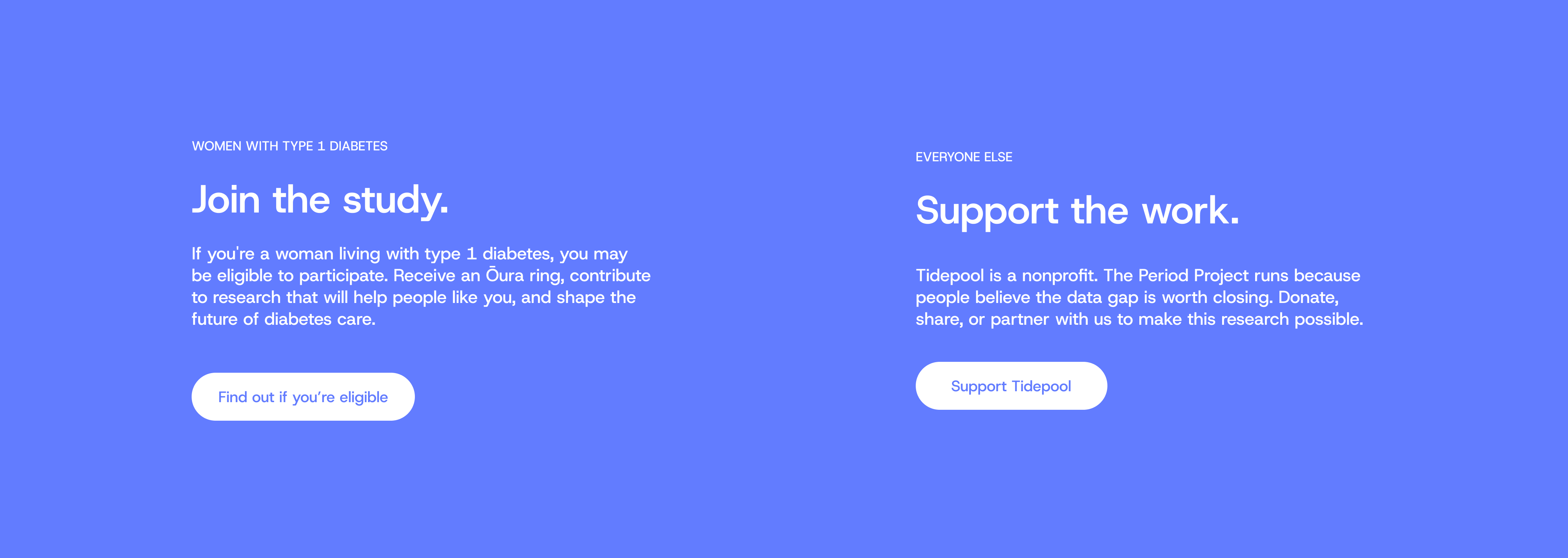
The page closed with a split CTA: one for women with type 1 diabetes who might be eligible for the study, one for everyone else who wanted to support the work.
Now what?
To validate the design before a real launch, I developed a proposed research framework built around the three goals I developed this solution to achieve:
Goal 1
Convey to the audience why this mattered
Goal 2
Communicate what Tidepool and Oura were doing to address it
Goal 3
Inform what the audience could do to help
The framework paired usability testing with a three-question survey, across twelve to sixteen participants split between the campaign's two audiences:
Audience 1
Women with type 1 diabetes
Audience 2
General public or press
What I learned
The research phase of this project taught me something I didn't expect:
Proximity to a problem isn't the same as understanding it.
I was closer to type 1 diabetes than most people were, and I still didn't know what I didn't know until I went looking for it.
My aunt lived with this disease for her entire life. The tools and guidelines she relied on were built on data that didn't fully account for her biology. That had a real impact on her longevity and quality of life, and the root cause wasn't widely known.
That was the awareness gap the campaign was trying to close. And it was a more honest argument for why this work mattered than anything I could have written in a brief.