


The Brief
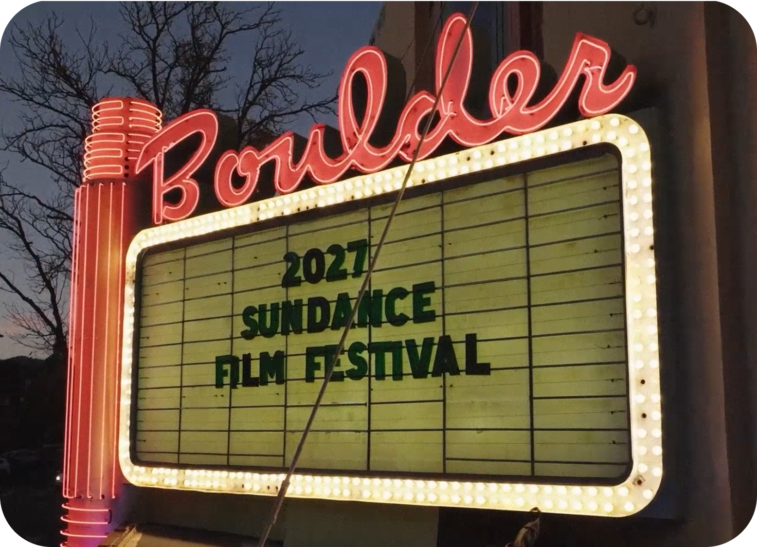
Sundance Film Festival is coming to Boulder for the first time in 2027. Alpine Modern, a specialty cafe in Boulder, has an enormous opportunity: bring Sundance foot traffic from the Pearl Street Mall up to its location on the Hill during the festival's ten days.
Investigate
I started by examining each brand separately before considering where they overlap.
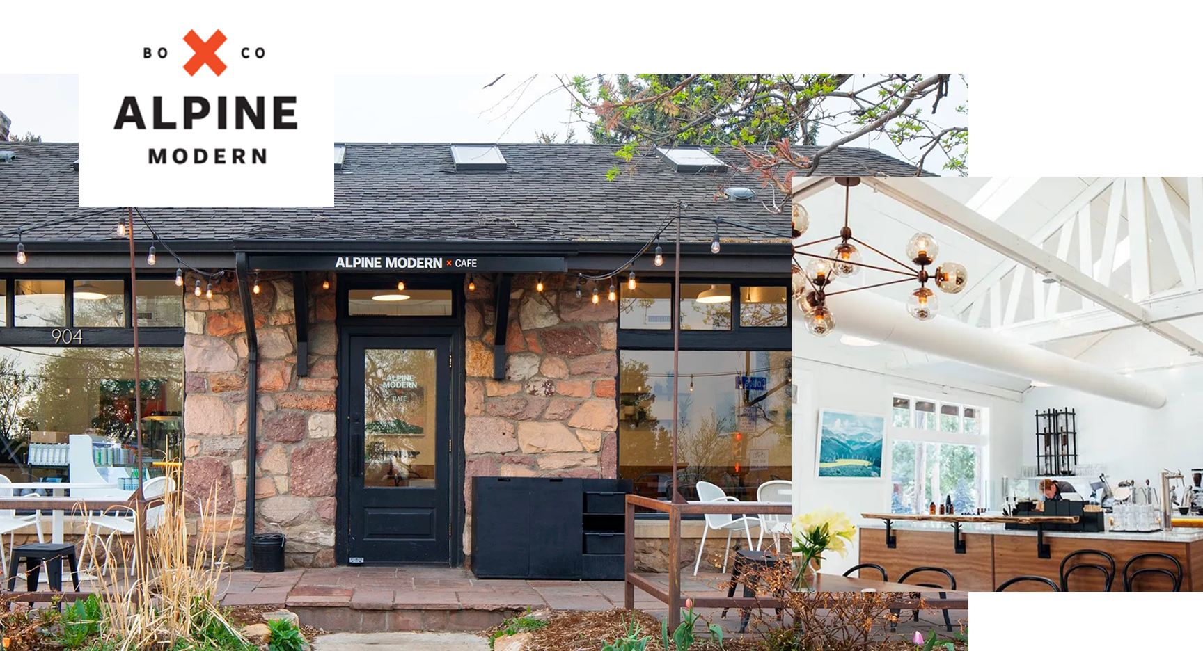
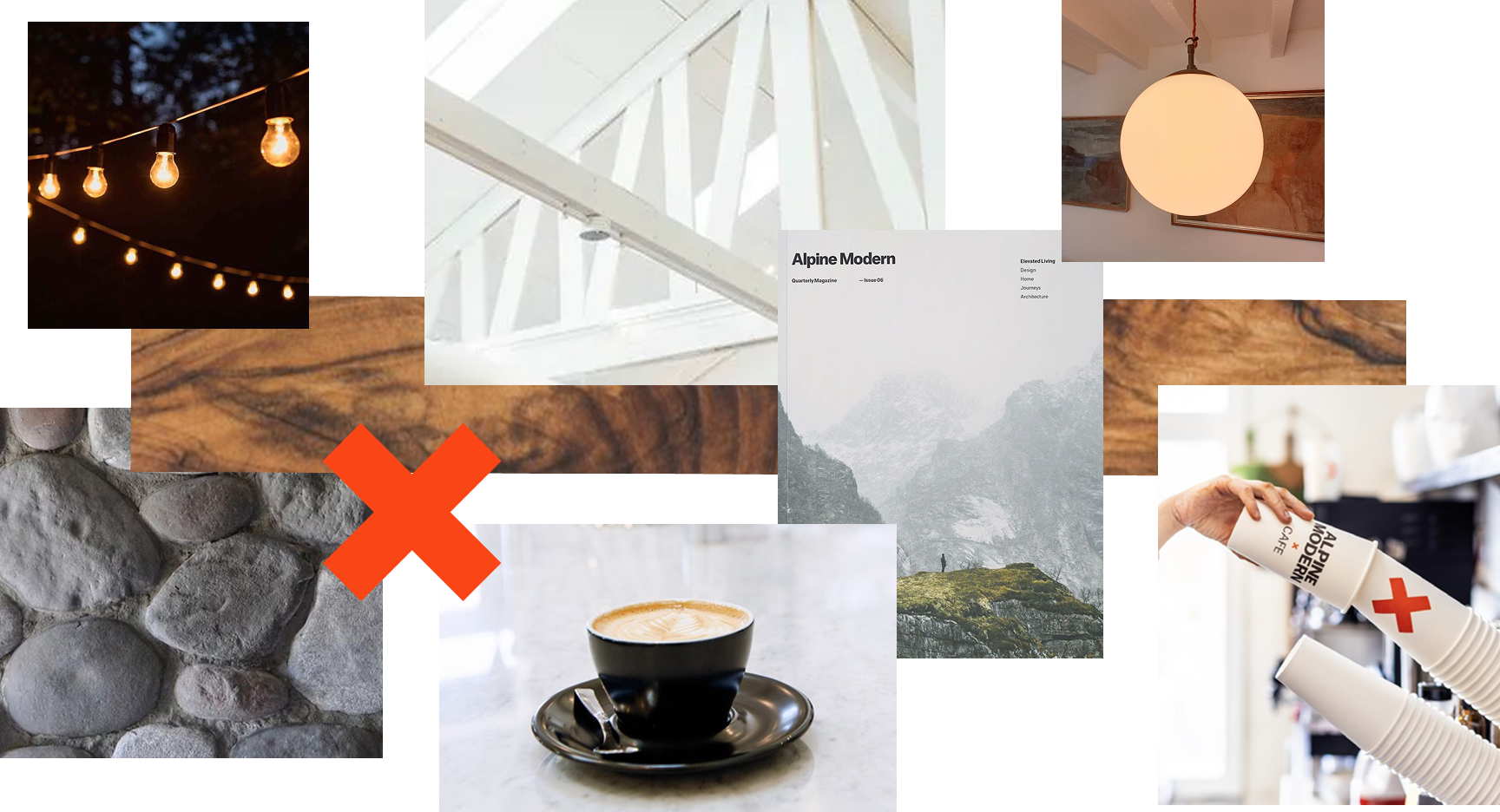
Alpine Modern is a deeply curated neighborhood cafe located halfway between downtown Boulder and Chautauqua Park.
Despite shedding its lifestyle brand roots, it still behaves like one. The space, the menu, and the aesthetic all communicate a point of view that goes well beyond coffee.
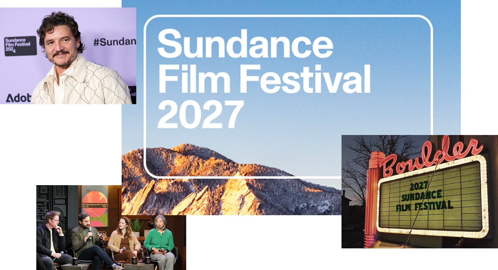
Sundance is the premier independent film festival.
It's prestigious but unpretentious, built around discovery and original storytelling. Its decision to relocate from Park City to Boulder rather than to a coastal city says something deliberate: it identifies with authentic Rocky Mountain charm over coastal glitz.
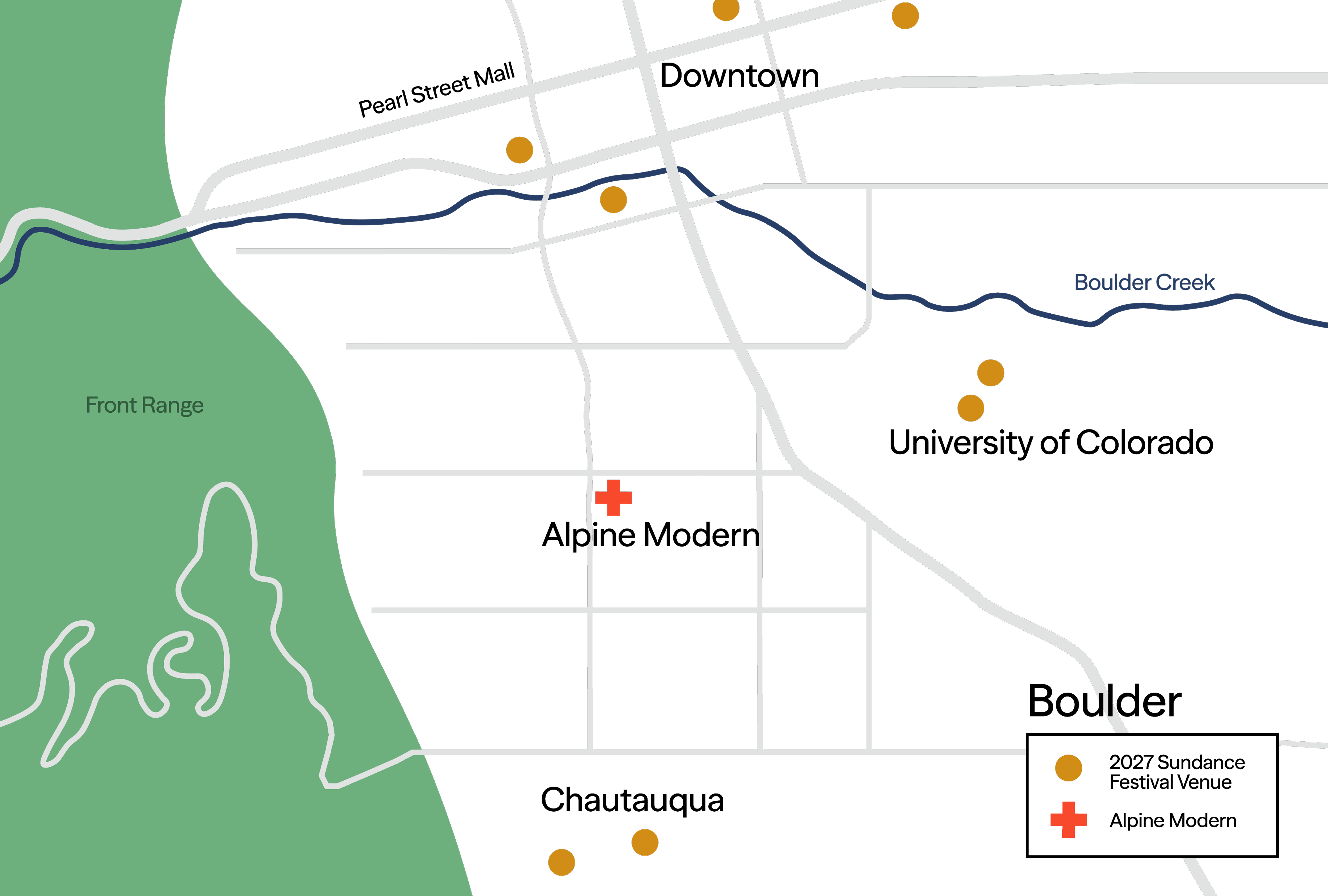
A key geographic insight became central to the strategy: Alpine Modern sits at the natural midpoint between downtown Boulder and Chautauqua, two destinations Sundance attendees were already going to. That means Alpine Modern isn't a detour. It's an obvious stop.
Find the opening
The collaboration needed to feel inevitable, not opportunistic. Two brands with strong individual identities risk diluting each other, or worse, producing something generic.
The real strategic question was:
What is the single true thing these brands share that justifies putting them in the same room?
The answer was craft.
Specifically, the belief that the best things in life are made by people who care deeply. This isn't a tagline; it's a guiding truth that both brands already embodied independently.
Give it a soul
From there, I built a brand framework around the brands' shared values, actions, and personality traits.
Values
- Craft
- Excellence
- Community
Actions
- Curate
- Connect
- Elevate
Traits
- Sophisticated
- Discerning
- Curious
I named the target audience The Aficionados.
The aficionados are culturally curious, design-conscious people who know the difference between good and extraordinary and care enough to seek out the latter.
Bring it to life
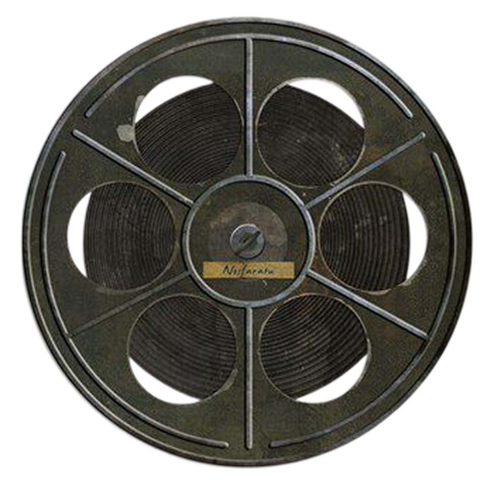
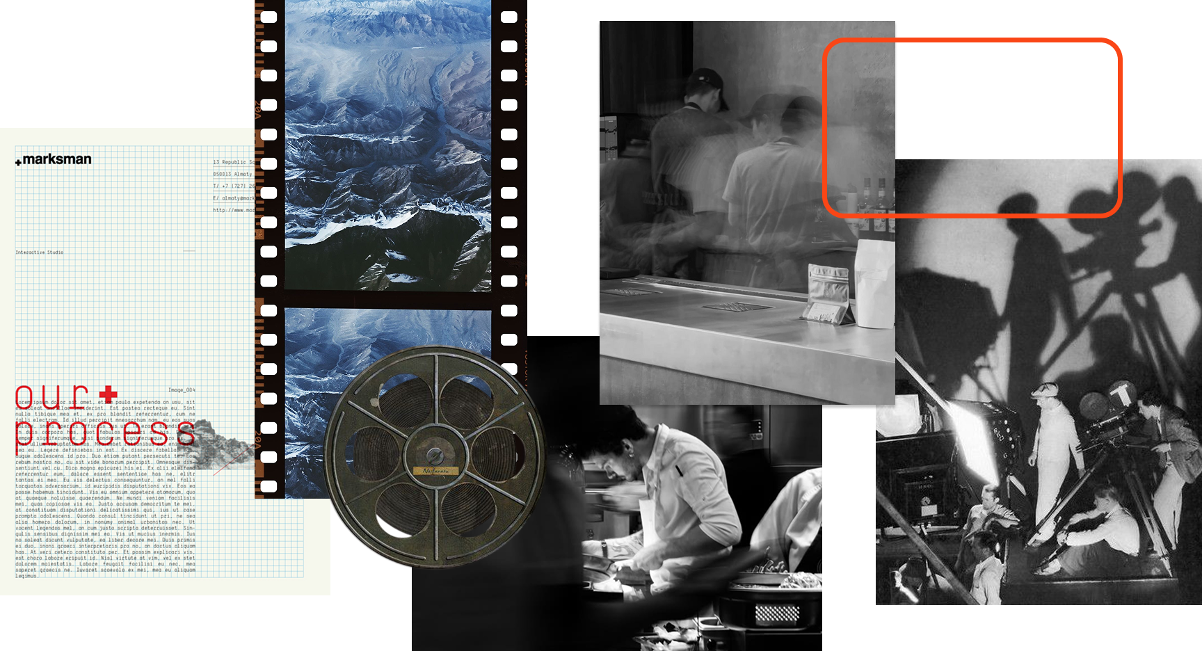
My inspiration for the project's color palette came from classic black and white movies and the white snowy landscape of Boulder in January, when the festival takes place. The buildings on the campus of the University of Colorado's clay roofing tiles, the Boulder Theater's iconic marquee, and the glow of sunset on snowy mountains supplied the jolt of orange to the palette.
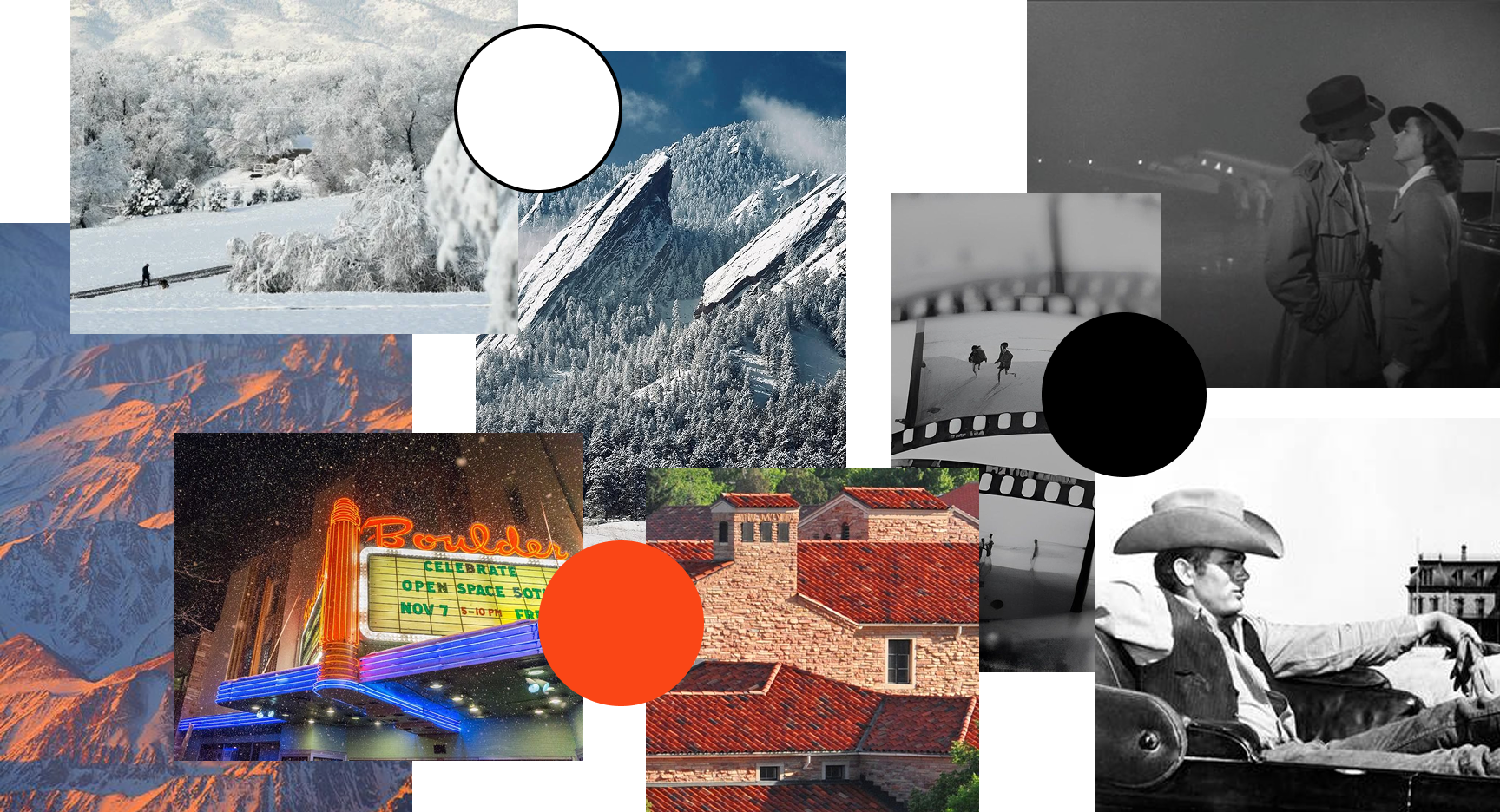
The design-aware Aficionados who will descend on Boulder for the festival will appreciate human craftsmanship, Swiss design, and touch of a detail-oriented professional — whether that be a filmmaker, photographer, or barista. This is where the visual qualities of the campaign stem from.
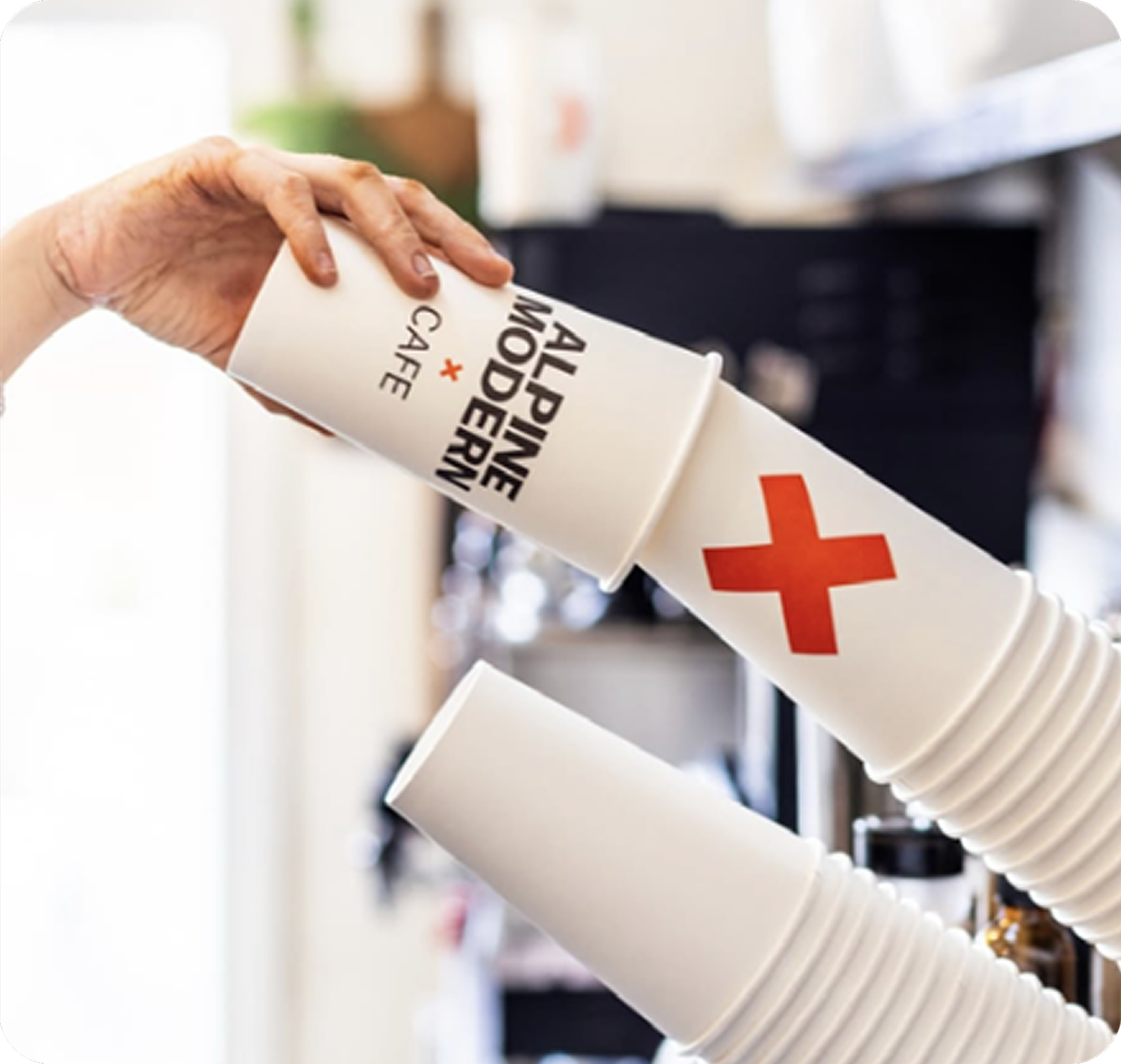
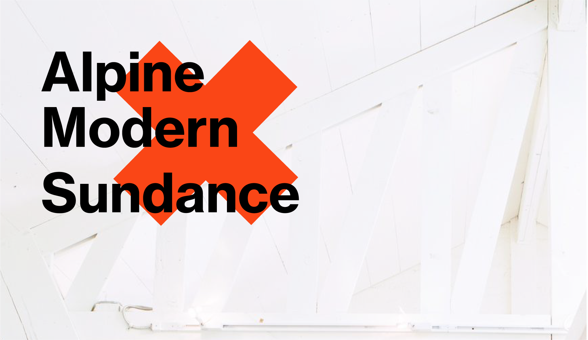
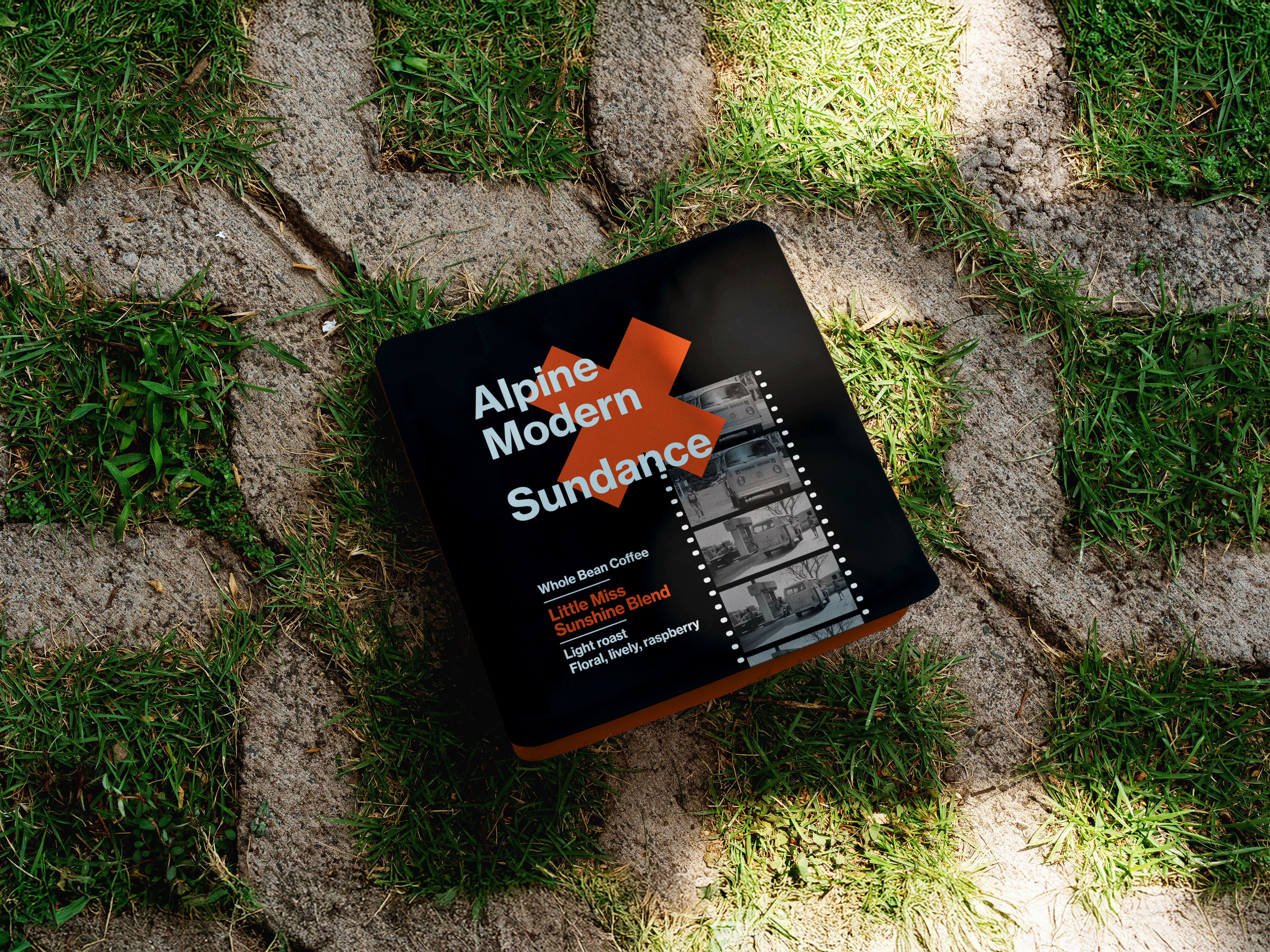
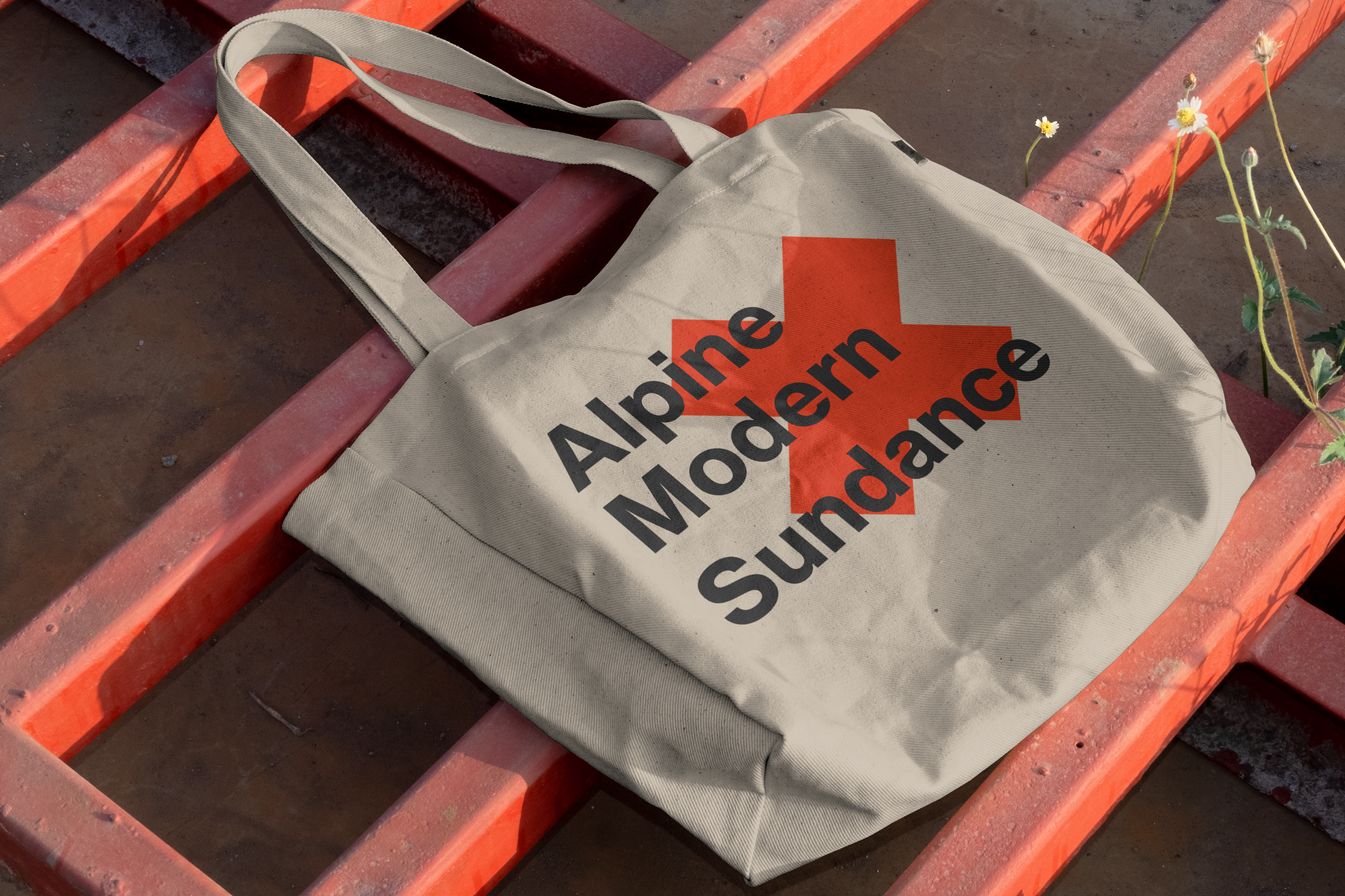
A full visual identity for the collaboration, expressed through a co-branded coffee release, limited-edition merchandise, and a canned espresso martini sold exclusively in Boulder during the festival's ten days.
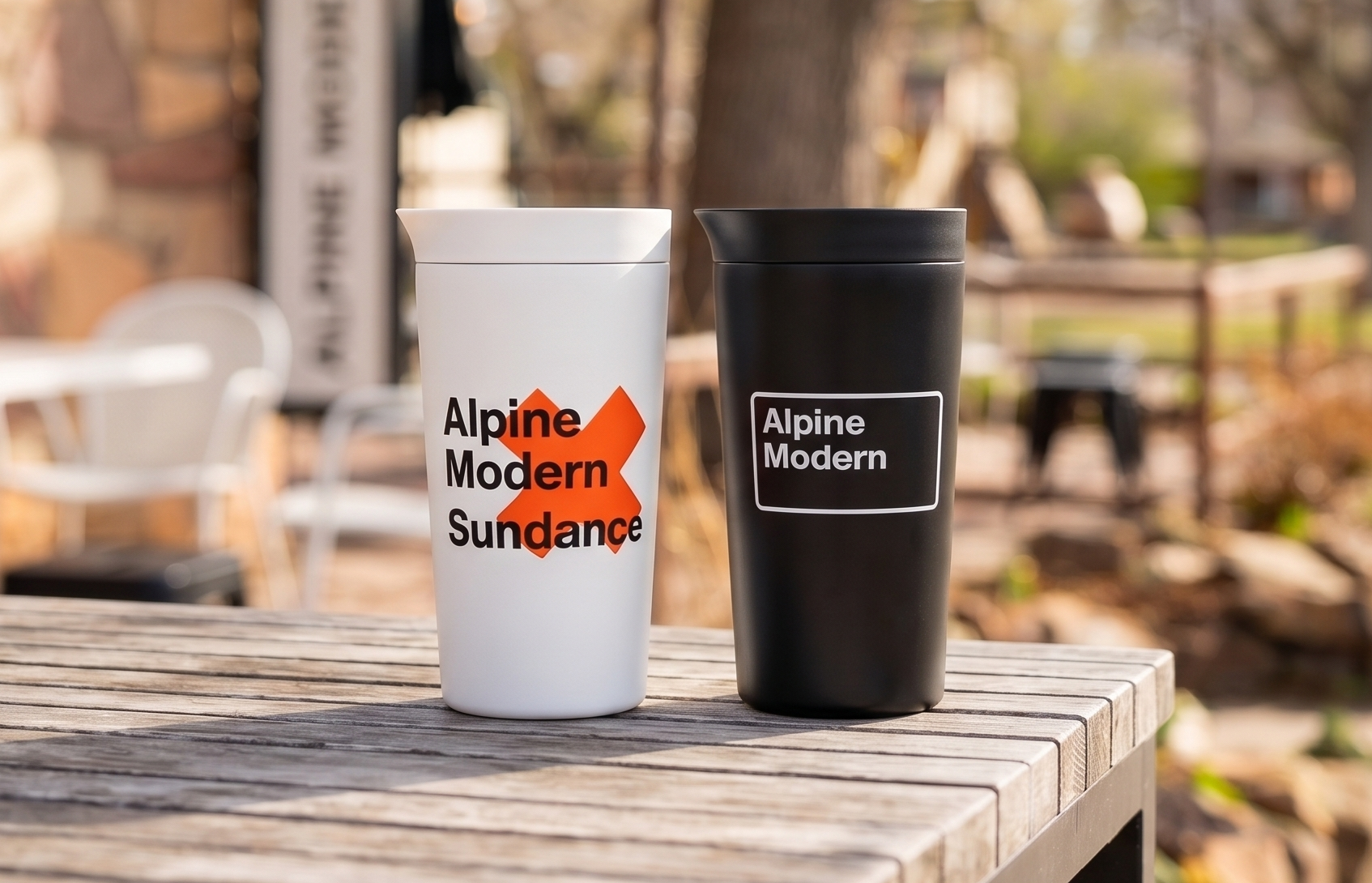
The physical anchor was The Cabin
A temporary activation that rebranded Alpine Modern's location on The Hill into the mountain soul of the festival. The Cabin is a place to recharge over craft coffee by day and unwind over carefully selected cocktails by night.
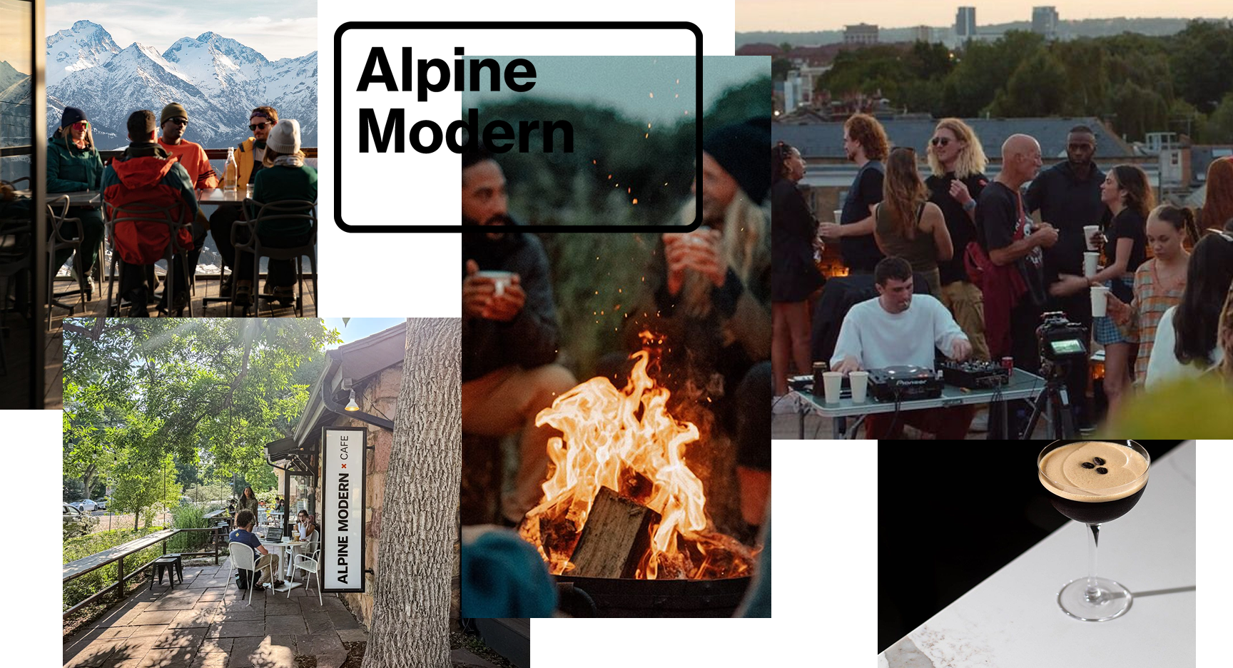
Reflection
Working with two brands instead of one presents challenges that a single rebrand doesn't.
You have to find genuine commonality and answer harder questions: why should these brands participate? What's in it for each of them? What made this project so enjoyable was that the answer came quickly — the audience overlap was excellent, the personalities aligned, and the geography did half the work. They were a natural fit.
The key learning: devote real time to finding an opportunity that doesn't feel forced.
Sometimes it presents itself immediately. Often you have to dig for it. But once you find an idea that genuinely works, the rest of the work is a joy to create.